Your home’s exterior color is the first thing neighbors and potential buyers notice, and it’s one of the easiest ways to dramatically improve curb appeal without a major renovation. The right exterior color scheme can enhance your home’s architectural style, boost its resale value, and reflect your personal taste. But, choosing house exterior color schemes involves more than picking your favorite shade from a paint chip. You’ll need to consider your home’s existing materials, the local climate, surrounding landscaping, and your neighborhood’s character. This guide walks you through the decisions and practical steps to select exterior colors that work for your home and last for years.
Table of Contents
ToggleKey Takeaways
- House exterior color schemes directly impact curb appeal, home value, and first impressions, making color selection a strategic investment rather than an aesthetic afterthought.
- Timeless color combinations like neutral with white trim, soft gray palettes, and earthy earth tones resist trending cycles and work across architectural styles and neighborhoods.
- Your climate, architectural style, and surrounding landscaping should guide color choices—lighter colors reflect heat in warm regions, while darker shades match traditional styles like Colonials and craftsman homes.
- Always test exterior colors by painting 2-by-3-foot patches on all sides of your home and living with samples for at least three days to account for natural light variations and interactions with your roof and landscaping.
- Invest in quality exterior paint and thorough surface preparation to ensure your chosen scheme resists fading, mildew, and weathering while maintaining its appeal for years to come.
- Bold color schemes work best on homes with strong architectural presence and clean lines, paired with neutral larger surfaces as grounding elements—avoid treating them as gimmicks on small traditional homes.
Why Exterior Colors Matter for Your Home’s Value and First Impression
Your home’s exterior is a visual statement. Unlike interior design, which only family and guests see, your exterior makes an immediate impact on everyone passing by. A cohesive, well-chosen color scheme signals that a home is well-maintained, increasing perceived value before anyone steps inside.
Color influences psychology and mood. Warm neutrals like cream or soft gray tend to feel approachable and timeless. Darker tones convey sophistication but can make smaller homes appear cramped. Bold colors like teal or terracotta can feel exciting or, if poorly executed, chaotic. The key is balance.
Paint durability matters too. Exterior paint must withstand UV exposure, moisture, temperature swings, and weather cycles. Lighter colors resist heat absorption, which is critical in warm climates. Darker shades show dirt and algae growth more readily, requiring more frequent cleaning. Understanding these trade-offs prevents regret after year two.
Classic And Timeless Color Combinations That Never Go Out of Style
Timeless combinations endure because they align with how humans naturally perceive color harmony and proportion. They work across neighborhoods and decades.
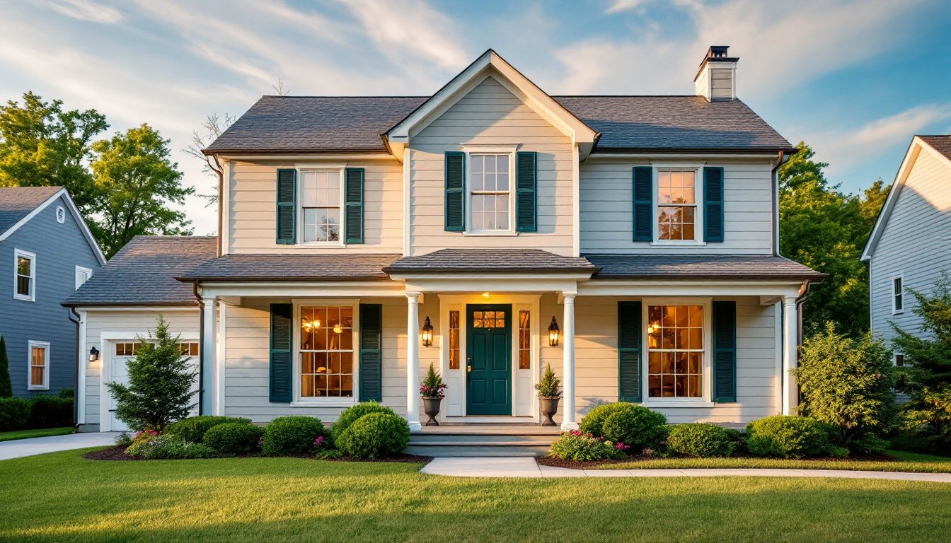
Neutral with neutral accent: Soft white or warm gray body with crisp white trim and shutters creates clean, classic appeal. This combo works on Capes, Colonials, and farmhouses. It’s forgiving, subtle color imperfections don’t jump out. White trim against a darker body (charcoal, deep green, or navy) adds definition without visual clutter.
Earthy earth tones: Warm beige, tan, or soft terracotta paired with dark brown or bronze accents mimics natural materials like clay and wood. This scheme feels grounded and works particularly well in arid or rustic settings. Think adobe or craftsman-style homes.
Soft gray and white: Modern gray has largely replaced stark white in contemporary tastes. Pairing light gray siding with white or cream trim and a darker gray or black roof feels balanced. It’s sophisticated without being cold.
The psychology behind these combinations is straightforward: the human eye finds contrast soothing when proportions are right. A 60-30-10 rule (60% dominant color, 30% secondary, 10% accent) creates visual harmony without overwhelming the eye.
Modern Minimalist Palettes for Contemporary Homes
Contemporary homes often favor monochromatic or near-monochromatic schemes. Think a single tone, medium gray, charcoal, or even taupe, across all exterior surfaces with minimal contrast. This approach demands precision in material selection and clean lines in architecture. A single misstep in color matching can look unintentional rather than minimalist.
Horizontal metal or fiber-cement siding intensifies the effect. So does eliminating visual breaks through continuous material or carefully concealed transitions. Contemporary minimalism works best with strong geometric shapes: it can feel flat on traditional homes with varied siding, shutters, and porch details.
Neutral metal accents (stainless steel, aluminum, or bronze) provide the only “color” contrast, keeping the palette controlled. Windows and doors become the focal point rather than color variety.
Bold and Eye-Catching Schemes for Statement-Making Homes
Bold color schemes demand confidence and a home that can carry them. A small ranch-style house painted hot pink might look gimmicky: the same color on a modern cube with large windows reads as intentional.
Successful bold schemes use contrast strategically. Deep jewel tones like forest green, navy, or burgundy paired with crisp white trim create visual drama without chaos. Warm terracotta or ochre (popular in Southwest and Mediterranean styles) pairs with white or sand-tone accents.
A single accent wall, perhaps the front gable or entry feature, lets you test boldness before committing fully. Painting just a porch ceiling in a contrasting color (deep blue, soft sage, or even blush) is trendy and reversible. Tools like exterior house colors and paint ideas showcase how designers layer bold palettes.
Boldness works best when grounded by neutral larger surfaces. Paint the body a soft neutral and the shutters, door, or trim a jewel tone. Reverse it cautiously, a bold body requires exacting trim and hardware choices to avoid visual confusion.
Be honest: bold colors require maintenance. They show dust, oxidation, and weathering more readily than neutrals. Commit to cleaning and touch-ups if choosing this path.
Choosing Colors Based on Architecture Style and Climate Considerations
Your home’s architectural style informs which colors feel authentic. Colonial homes suit deep, traditional greens or blues with white trim. Craftsman and bungalows pair with warm earthy tones and darker accents. Mediterranean styles thrive in terracotta, stucco white, or dusty ochre. Modern architecture leans minimalist or bold monochromatic.
Ignoring style creates visual discord, imagine a Victorian mansion painted hospital white or a minimalist cube in fussy traditional patterns.
Climate shapes both color choice and durability expectations. In hot, sunny regions, lighter colors reflect heat and reduce cooling costs. Dark colors absorb heat, making interiors hotter. Conversely, in cooler climates, darker colors absorb solar radiation, helping with heating efficiency (though the effect is modest).
Ultraviolet exposure fades pigments faster in sunny climates. Darker colors fade to washed-out tones: brighter colors can look dingy. Coastal regions expose paint to salt spray and moisture, accelerating degradation. High-quality exterior paint rated for your climate is essential, don’t skimp.
Resources like Southern Living showcase regional color trends: Southern homes favor soft pastels and traditional greens, while Northern designs often lean neutral or bold. Consider your region’s vernacular architecture for guidance.
Also account for surrounding vegetation. Dense green landscaping calls for cooler tones or whites to avoid visual clash. Desert or sparse yards pair with warm earth tones. Reflect on what complements, not fights, your surroundings.
Testing Colors and Making Your Final Selection
Avoid buying five gallons of paint and hoping it looks right. Testing is non-negotiable.
Start with paint samples. Most retailers sell sample-size paint (pints or quarts). Paint 2-by-3-foot patches on different sides of your home, north, south, east, west, so you see how light changes throughout the day. Overcast days look different than sunny ones. Morning light differs from evening. Live with samples for at least three days.
View samples in context. Observe how the color interacts with your roof, landscaping, driveway, and neighboring homes. A color that looked perfect indoors might clash with your surroundings.
Account for undertones. Whites, grays, and neutrals have undertones, warm (yellow, pink, or red) versus cool (blue, green). A “white” with warm undertones might look peachy on your home, while a cool-toned white reads clean. Match undertones to your roof and trim for harmony.
Get a second opinion. Show photos of your sample patches to a trusted friend or family member. Personal preference is paramount, but an external perspective catches visual discord you’ve stopped noticing.
Consider long-term appeal. Trendy colors feel dated quickly. Resources like Home Bunch feature timeless schemes that lasted decades. Ask yourself: will this color feel fresh in five years, or will you tire of it?
Once committed, invest in quality exterior paint, premium products resist fading, mildew, and weathering far better than budget options. Prep surfaces thoroughly: pressure wash, scrape loose paint, fill gaps, and prime bare spots. Rushed prep leads to adhesion failure and premature peeling, undoing even excellent color choices.
Conclusion
Choosing house exterior color schemes is a blend of aesthetic preference, architectural respect, climate reality, and long-term durability. Take time to test, research your home’s style, and consider your region’s vernacular. Quality paint and thorough prep work ensure your chosen scheme lasts and ages gracefully. Your home’s exterior deserves thoughtfulness, it’s the frame for everything inside.